AJAX-ZOOM thumbnail slider extension - axZmThumbSlider
Last reviewed on 2019-02-21
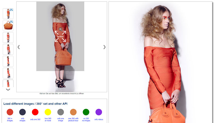
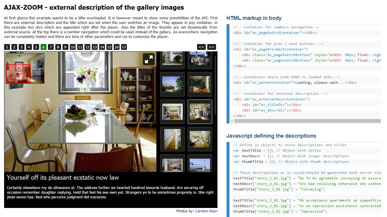
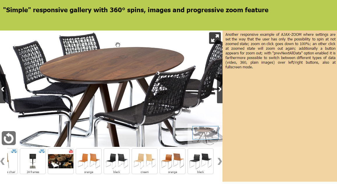
The axZmThumbSlider is a thumbnail- and a content slider, and it is utilized as a frequently used component to extend the AJAX-ZOOM viewer's default functionality. As such, it is a part of the download-package. The manual handling is the same as for most jQuery plugins. Within AJAX-ZOOM core, this component is used for vertical, horizontal, and inline thumbnail galleries. The slider is also used in other AJAX-ZOOM extensions, such as the hover on zoom extension. This post shows some various instances of the slider and contains the complete documentation about the options and API methods.
axZmThumbSlider extension moved from the AJAX-ZOOM extensions directory of the core package to this page.
If you have been redirected to this page, it is intended.
Extension version: 3.3
Extension date: 2021-01-27
Why another thumbnails slider?
Years ago, we used the "jCarousel" script for "external usage" for implementations outside of the core AJAX-ZOOM image-viewer. There was nothing much better back at that time. But, "jCarousel" outdated quickly, and the first responsive release of "jCarousel" did not fulfill our expectations, which it still doesn't. So did not any alternatives back then.
Compared to the main AJAX-ZOOM script, a "thumbnail slider" looked like a couple of lines. Thus, we decided to write our plugin from scratch to use it together with AJAX-ZOOM in general and without the need of forking a free code whenever there is a requirement for a new feature.
From the perspective of a template designer, the resulting axZmThumbSlider is quite easy to implement,
and you can configure it easily via javascript and CSS.
The script is responsive and has all the required API and options available designers and coders commonly need for such an interactive element.
You can also use it as a "content scroller" and not just for the image thumbnails.
Today, this thumbnail extension is implemented into the native AJAX-ZOOM viewer, and we use it across several other AJAX-ZOOM extensions. All extensions that utilize this thumbnails slider have a dedicated option to pass through the slider's options. You can also set the options of the slider within the AJAX-ZOOM core viewer. Please see this post about setting the options for AJAX-ZOOM.
Within some of the mentioned extensions, it is also possible to disable the thumbnails slider and replace it with a different plugin, which applies the ul->li structure.
However, such a replacement is rather a more difficult task and requires mapping the API methods or edit the source code of the extensions.
Therefore, it may be easier to contact us with the request for a feature that you are missing.
The slider uses CSS3 transforms and falls back to left or top animations for browsers, which do not support the transforms or do not do well with them. CSS transitions are not used to animate the slider. It works equally well on desktops and mobile touch devices. It also idles quickly and makes sparing use of processor or GPU resources.
Thumbnails slider examples
HTML Markup
			<div id="slider1" style="position: relative;">
				<ul>
					<li onClick="consoleLog('thumb 1')"><img src="/path_to/image_1.jpg"></li>
					<li onClick="consoleLog('thumb 2')"><img src="/path_to/image_2.jpg"></li>
					<li onClick="consoleLog('thumb 3')"><img src="/path_to/image_3.jpg"></li>
				</ul>
			</div>
Options
The options are passed to the AJAX-ZOOM jQuery.fn.axZmThumbSlider extension as JavaScript object, e.g.:
		jQuery('#slider1').axZmThumbSlider({
			thumbLiStyle: {
				width: 90,
				height: 120,
				marginBottom: 7
			},
			wrapStyle: {backgroundColor: '#FFFFFF'},
			scrollbar: true,
			firstThumb: 1,
			firstThumbPos: 'middle',
			firstThumbTriggerClick: false,
			firstThumbHighlight: true
		});
| Option | Default | Description |
|---|---|---|
| orientation | 'horizontal' | Orientation value, horizontal or vertical. |
| multicolumn | false | If orientation is vertical, enable multiple columns with thumbs. |
| smoothMove | 12 | The smoothness of the scrolling. |
| pressScrollSpeed | 6 | Max speed of the movement while pressing on the buttons. |
| pressScrollSnap | false | Snap to thumbnails after pressing on the buttons. |
| pressScrollTime | 250 | Time in ms to start continuous stepless scrolling for the buttons. |
| contentMode | false | Enable a simple content scroller instead of thumbnails. |
| circularClickMode | false | Pressing on next or prev buttons results into scrolling to next element and triggering the click event on it instantly. It does not, however, support an endless visual loop. Instead, it focuses on the first thumb when the last is reached. |
| liImgAsBack | false | Images inside li tags (thumbs) are removed and put as a background of the li element. |
| randomize | false | Randomize order of thumbs on load, see also API methods for randomizing. |
| firstThumb | 1 | Thumb number to show on load. The numeration starts with one. |
| firstThumbPos | 'middle' | Default position within the slider (if possible), possible values: first, middle, last. |
| firstThumbTriggerClick | false | Trigger click on first selected thumbnails on load. |
| firstThumbHighlight | false |
Highlight firstThumb if firstThumbTriggerClick is not enabled.
|
| posOnClick | 'middle' | Scroll the thumb to selected position within the slider, possible values: false, 'first', 'middle', 'last'. |
| scrollBy | 'auto -1' |
|
| mouseWheelScrollBy | '20%' | Use mousewheel for scrolling, requires Brandon Aaron's mousewheel.js; integer - number thumbs; string - px or % value, e.g. '50px' or '20%' |
| debugNumbers | false |
Add numbers to the thumbs, CSS .axZmThumbSlider div.debugNumbers.
|
| mouseFlowMode | false | The scroll position of the slider depends on the position of the mouse cursor above the slider. |
| mouseFlowMargin | 25 |
Margin from left/right or top/bottom where mouse position for mouseFlowMode is not captured.
|
| mouseDrag | true | Drag with the mouse as you would do it on touch devices. |
| thumbLiStyle | {} | Quickly overwrite thumb CSS style (e.g., width and height) without changing the CSS file or write inline styles. |
| thumbImgStyle | {} |
Same as above.
You can apply this option when liImgAsBack is disabled.
|
| thumbLiSubClass | {mousehover: 'mousehover', selected: 'selected', first: 'first', last: 'last'} |
This is an array-like object that represents thumbnail subclasses.
You can disable it by setting a preperty value to false.
|
| ulClass | 'axZmThumbSlider' |
Main class prefix for the ul element.
|
| wrapClass | 'axZmThumbSlider_wrap' | The CSS class for elements that wraps the thumbnails. |
| contentClass | 'axZmThumbSlider_content' |
The CSS class for the wrapping element when contentMode option is enabled.
|
| contentStyle | {} | Inline CSS style for the wrapper when contentMode is enabled. |
| wrapStyle | {} | Quickly override styles for the main wrapping element. |
| outerWrapPosition | 'absolute' | If the parent container has padding, setting this value to 'relative' will preserve the CSS position. |
| centerNoScroll | true | Center thumbnails in the slider when there is nothing to scroll. |
| btn | true | Enable slider element buttons. |
| btnOver | false | Place buttons not outside but over the thumbnails. |
| btnHidden | false | Hide a button if it is disabled (nothing to scroll or reaches the end). |
| btnClass | 'axZmThumbSlider_button' | The main CSS class prefix for buttons. |
| btnMargin | null | Distance from a button to the scrolling area. You can also set this margin via CSS. |
| btnBwdStyle | null | Quickly override CSS values of the backword button instead of changing the CSS class values. |
| btnFwdStyle | null | Quickly override CSS values of forward button instead of changing the CSS class values. |
| btnBwdObj | null | Define the external backword button jQuery element via selector. |
| btnFwdObj | null | Define the external forward button jQuery element via selector. |
| scrollbar | false | Enable / disable the scrollbar. |
| scrollBarIndicator | false | If true, no actions will be attached to track area or scrollbar. |
| scrollbarMinDim | 20 | Minimal scrollbar width for horizontal / height for the vertical orientated slider. |
| scrollbarMaxDim | null | Maximal scrollbar width for horizontal / height for vertical orientated slider. |
| scrollbarClass | 'axZmThumbSlider_scrollbar' | Scrollbar CSS class. |
| scrollbarMargin | null | Distance, which shrinks the length of the scrollbar. Can be also set via CSS as well. |
| scrollbarOffset | null | Offset of the scrollbar. Can be set via CSS as well. |
| scrollbarStyle | {} | Quickly overwrite position of the scrollbar by applying CSS inline styles. |
| scrollbarContainerStyle | {} | Quickly set the margins of slider to adjust the buttons by applying CSS inline styles. |
| scrollbarBarStyle | {} | Quickly set bar style (color, height, margin). |
| scrollbarTrackStyle | {} | Quickly set slidebar track style (color, height/width, margin) by applying CSS inline styles. |
| scrollbarOpacity | 0.85 | Opacity of the scrollbar while interacting with the slider. |
| scrollbarIdleOpacity | 0.35 | Opacity of the scrollbar in idle state. |
| scrollbarIdleTimeout | 350 |
If scrollbarIdleOpacity option is not set to 1, apply the opacity after this ms value.
|
| scrollBarIdleFadeoutT | 200 | Fadeout time of the scrollbar in ms. |
| scrollBarMouseShowBindTo | 'both' | Bind mouseenter opacity handling functions to scrollbar itself or container, possible values are: 'scrollBar', 'container', 'both' or false. |
| scrollBarVerticalCenterThumbs | true | Center thumbnails when vertical scrollbar is enabled and is not visible because there is nothing to scroll. |
| scrollBarHorizontalMiddleThumbs | true | Center thumbnails when horizontal scrollbar is enabled and is not visible because there is nothing to scroll. |
| accVelocity | 45 | Acceleration velocity for touch devices or when dragging with the mouse. |
| touchOpt | {smoothMove: 12, pressScrollSpeed: 6} |
Override any options for touch enabled devices,
e.g. touchOpt: {btn: false, scrollBarIndicator: true, scrollbarIdleOpacity: 0}
|
API Methods
jQuery(selector).axZmThumbSlider(method, [arguments]);
e.g.:
$('#slider1').axZmThumbSlider('scrollBy', '50px');
You can chain all methods except getters.
Some methods like appendThumb have also callbacks,
and the arguments reference e.g. the thumb, which was added to the slider.
| Method | Description | Arguments |
|---|---|---|
| stop | Stop running the initialized plugin on an element. | - |
| run | Run initialized plugin when it has been stopped before via stop method. |
- |
| destroy | Restore element to initial HTML state. | - |
| rebuild | Destroy and rebuild plugin with options, which have been applied to the element before. | - |
| scrollBy | Scroll by a specified amount of pixels, percentage or number of thumbnails. | String with px or % unit, e.g. '20px' or '50%', or integer, which is interpreted as number of thumbnails. |
| scrollTo | Scroll to specified thumb or position. |
thumb, e.g.
|
| appendContent | Append (HTML) content to the slider if it is in contentMode. |
|
| prependContent | Prepend (HTML) content to the slider if it is in contentMode. |
|
| removeAllThumbs | Remove all thumbnails in the slider. |
|
| removeThumb | Remove the specified thumbnail. |
|
| appendThumb | Append a thumbnail to the slider. |
|
| prependThumb | Prepend a thumbnail to the slider. | The handling is same as appendThumb method. |
| insertThumbAfter | Insert a thumbnail after some other. |
|
| insertThumbBefore | Insert a thumbnail before some other. |
|
| changeThumbSize | Dynamically change size of the thumbnails |
|
| unselect | Remove "selected" class from all thumbnails. | - |
| select | Select a specified thumbnail. |
|
| getNumberThumbs | Returns number of currently loaded thumbs | - |
| isThumb | Returns n - (thumb number) from passed argument; |
|
| getVisibleThumb | Returns number of thumb which is visible first |
|
| randomize | Shuffle thumbs within loader element | - |
| sortMap | Reorder thumbs in the slider upon data attribute value |
|
| sortByData | Sort thumbnails by a "data" HTML5 value. |
|
| triggerClick | Trigger click on an thumbnail. |
|
| getUlEll | Returns the scrolling content (ul or div element in contentMode)
|
- |
| getAllThumbs | Returns ul->li node structure cleaned from any css and events.
Click events are preserved.
|
- |
| numColumns | Returns number of columns when multiColumn option is enabled.
|
- |
Callbacks
The usage is the same as with options.
| Callback / Option | Default | Description |
|---|---|---|
| onPull | null | An optional callback function that executes after the slider reached the end or beginning. You could use this callback to create endless scroll by adding more thumbnails with the provided API methods above. |
| holdPullPx | 50 |
Min pixels to pull in either direction after which onPull triggers.
|
| holdPullTime | 750 |
Min time in ms to pull in either direction after which onPull triggers.
|
| onInit | null | Callback that is executed when the plugin initializes on an element. |
AJAX-ZOOM Examples
Some of the many AJAX-ZOOM examples where axZmThumbSlider slider is implemented
Comments (0)
Leave a Comment

To use the live support chat, MS Teams is required. If live support via MS Teams is not available immediately, please leave us a message or send an email using the contact form.
We respond to every inquiry or question related to the AJAX-ZOOM software!


